The Philadelphia Eagles have updated their word mark and it is flat out awful. This is without a doubt a step backwards for their branding. Going from an instantly identifiable word mark to this remedial effort is so uninspiring I am (almost) at a loss for words.
Yes, the former word mark is dated and was in need of a refresh. Note, refresh not rebrand. Going from the 3D design to this flat boring look is a complete miss from the design department. There is no heart, no soul, no anything with this.
Choosing to imitate the lettering from the awful Jets uniforms was a bold strategy and by bold I mean terrible.

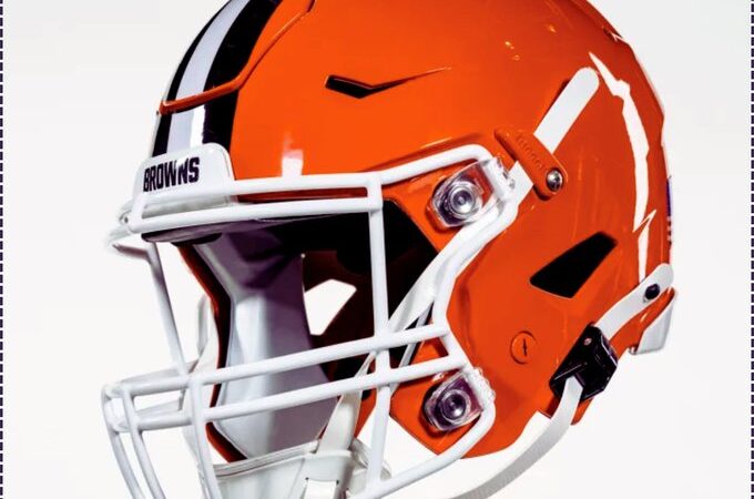
Let’s hope that any changes to their uniform do not follow this same path. Many teams have fallen victim to bad re-designs in recent years, not just the Jets. The Browns, Falcons, and Jaguars have all gone too extreme in one direction with their looks and avoiding that misstep would be wise.
Discover more from This Is Believeland
Subscribe to get the latest posts sent to your email.